

Tutorials – Texturing
About : This tutorial provides tips on how to nicely texture a game environment. This is a simpler version of the texture chapter in my level design book. The tutorial is divided into three pieces. Art, Tech and Unreal. Art is more about how to get a good looking environment while Tech and Unreal are about technical tips and techniques, settings and properties to make it pretty. Do note: This is not a shader or advanced material tutorial.
Target Audience : Beginners and Intermediate
Platform : Anything/Unreal Engine 2
Last Update : August 2006
Art
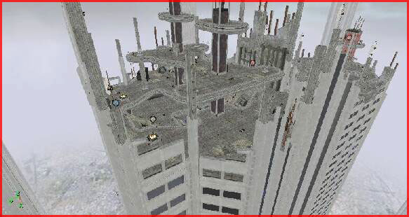
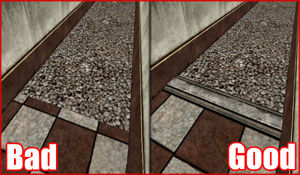
The most common beginners mistake are badly align textures.
There are several types of misaligned textures. There are the textures that simply don’t have a single alignment such as the floor in the example screenshot or it could be that the scale of two surfaces don’t match at all. You can see a bit of that on the far right of the screenshot (the gray pillar) Related to that is texturing the environment using both very low resolution as high resolution textures. The result will be that you can clearly see a difference between the two types of textures, especially on lower detail settings.
Even while you will always have SOME misaligned textures SOMEWHERE you do have to try and minimize the amount of misalignments. The whole problem with misaligned textures is that they can destroy the illusion of a virtual environment. You obviously want the players to experience your environment as good as possible. Obvious errors will make your environment look fake and they will make you as an author look sloppy and lazy.
It doesn’t take a lot of trouble to align a surface such as the floor from the example picture. In Unreal you can make the two surfaces auto align to each other using F5 and in 3DSMax you can apply a simple planar Z UVW map on those two poly.
Another common mistake is to apply a texture to a too large and flat surface.
Although this is strongly related to the geometry be careful with texturing large flat areas such as walls and floors. It can greatly improve the visuals if you add a few extra brushes/polys to bring more variation and definition to the texturing. If you don’t break things up it will look boring and repetitive and you will have a hard time hiding the tiling pattern.
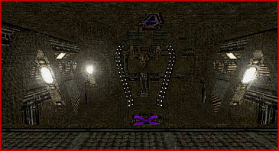
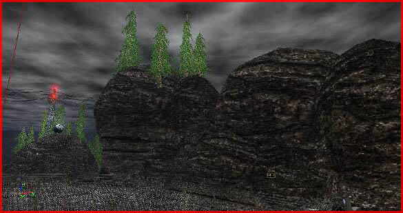
A mess of styles and colors is another common mistake. You must create a consistent and coherent texture pallet and stick to that selection of textures or the result might be a mess.
The level in the screenshot uses a very wide range of different textures. The colors nor the styles match each other. The logic behind this texturing appears completely random and thus not very realistic or credible at all.
The texturing of a level forms the base for the lighting. Bad texturing can mean bad lighting. If your textures have issues you will not be able to hide those issues and fix the problem with lighting.
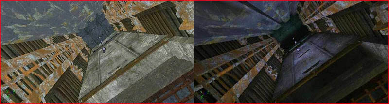
Even though blue lights have been applied to this elevator shaft it still is a mess.
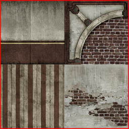
Good texturing means consistent and coherent textures in both style, theme, color and size and textures that make a good base for the lighting to be applied on. Following pictures are well textured.
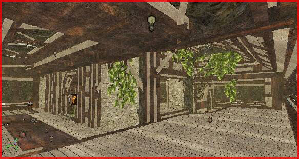
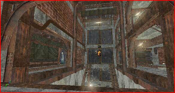
They make use of a consistent and limited set of textures.
That brings us to another point: The brightness and saturation of textures. Textures must have a pretty low saturation and a decent brightness. It is better to have too bright textures than too dark textures. Dark textures cannot be lighted! Black or anything near black will not accept lighting. This also goes for saturation. If a texture is very saturated orange you will only be able to apply orange lights in that area. Any other color will look bad and that is not good. Textures must be able to be reused in a wide range of situations and the lighting should not be dependent on the color of the textures.
That was a bad example. The textures are incredibly dark and thus very hard to lighten.
That was another bad example. The rocks are way too dark.
The brightness issue is especially when issue in a snow environment. Snow is obviously very white thus almost any texture looks dark in comparison to snow.
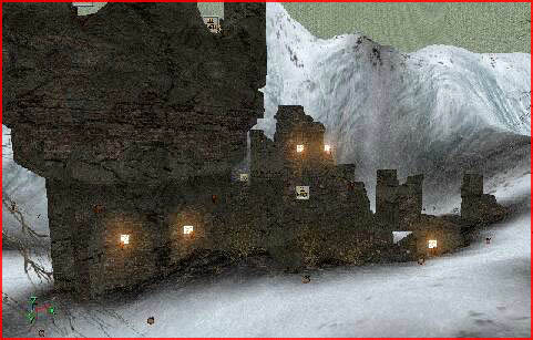
That was a yet another bad example and you will not being able to light an environment like this successfully. You need powerful lights if you want to notice anything of the lighting on the buildings while on the other hand the snow requires very little lighting since it is so white. It is impossible to make the lighting match both the buildings as the snow.
Try to make the other textures as bright as possible. Try to make them match the snow as good as possible.
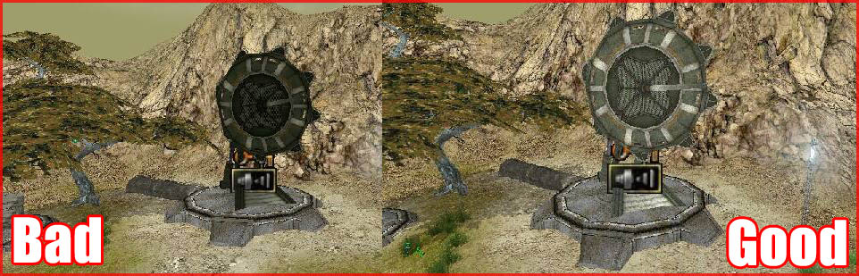
The texture of the satellite in this example was way darker than the surrounding environment thus it had to be brightened. The result must look consistent always and in every situation.
Good examples or correct brightness and saturation levels were the four screenshots found above the brightness/saturation section
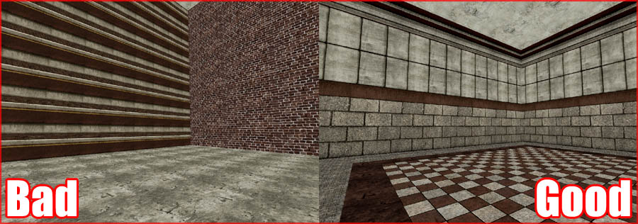
Yet another often mistake is to not trim of edges. If a texture reaches the end of an object it can appear to be cut off. You want to add a little edge in such situation
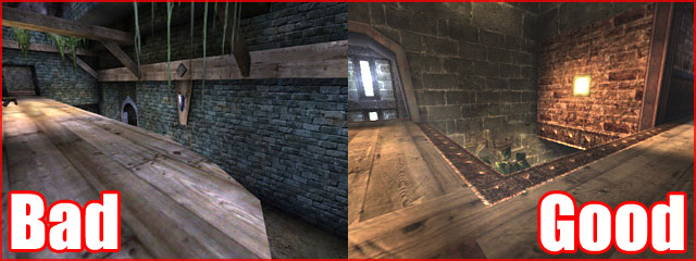
Notice the trimming on the edges of the walls, doors and floor in the good picture..
That is also valid when two different textures touch each other. Add an edge in between the two to polish it.
Tech
Water
If your engine does not support very advanced (pixel shader) water you might get away using multiple layers on top of each other to make pretty water. The GTA games occasionally utilize this technique for example.
In my level ONS Dinora the water was made up out of two layers. The first layer was a standard watershader with a special specularity mask material to bring a type of wave pattern to the specularity while the second layer provided the highlights and little white dots or reflected light you often see on water.
If you can’t make your shader any more complex simply use more (mesh) layers to overlay different shaders on top of each other.
Unreal Engine 2
Depth Complexity View
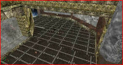
In Unreal Engine 2 there is a Depth Complexity Viewport mode. The depth complexity viewport mode shows you on what spots there are too many layers of objects/textures behind each other. Textures with alpha or translucency are particularly critical for the depth complexity. Smoke, coronas, trees, vegetation and so on can become very red in this viewport mode and red obviously is not good.
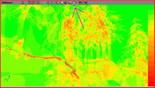
A little red as in this example picture is ok, a lot of red however is not and can slow down your PC greatly. Delete some objects and make more intensive use of masking instead of alpha to fix it.
Masking vs Alpha
Unreal Engine 2 again. Masking and Alpha both use the alpha layer in an image. The difference however is that Masked is harsher than Alpha. While Alpha supports transparency masking is either completely visible or not and because of that is is A LOT faster than alpha. Do NOT use alpha when you don’t have to. Trees and grass for example will do fine with Masking instead of the very expensive Alpha. Sure it might look less good but you can gain a lot of FPS with it.
Wrapping
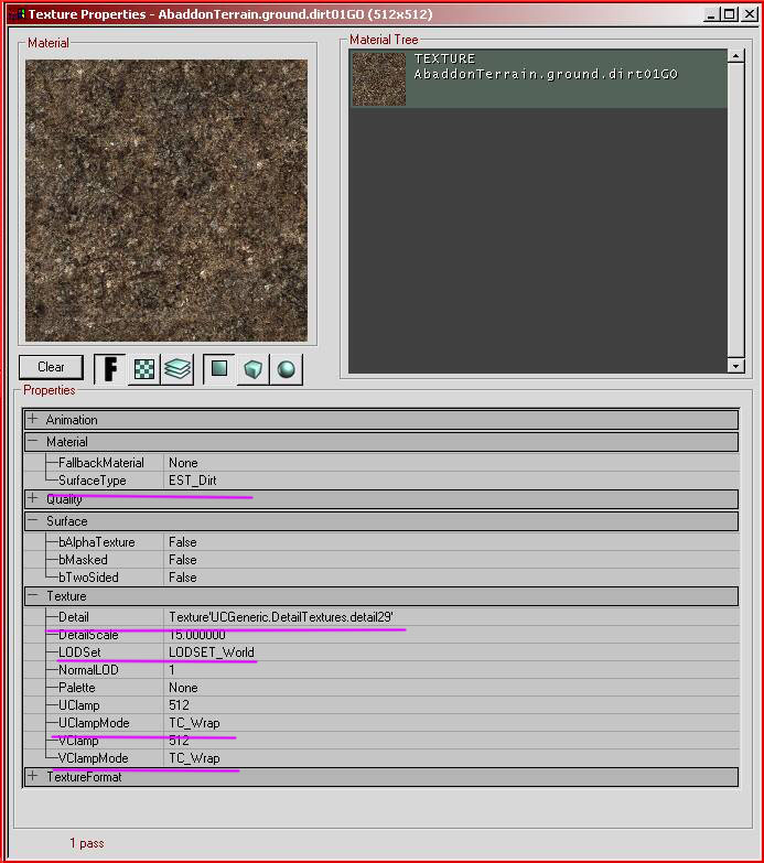
Skybox and cubemap textures as well as things as certain vegetation textures must be set to Clamp instead of Wrap to prevent small seams from showing up on low detail settings. The wrap/clamp can be found in the properties of every texture in the section Texture (UclampMode and VclampMode). Clamping means the texture will only be rendered once. Wrap means that it will repeat itself (and thus tile).
DetailTextures
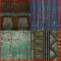
UT and UT2004 fully support detailtextures. Assign them! It takes little time to do and those who don’t like detailtextures can still turn them off in the ini.You can add a detailtexture in the properties of a texture.
Compression
All textures in UT2004 MUST be compressed either in Photoshop or in UED itself by rightclicking a texture > Compress. Without any type of compression you PC can run into trouble and your levels filesize will be huge. DXTC1 should be used for most textures. 3 When the texture has a gradient in it or when you intend to use the texture for Masking. 5 When you intend to use the texture as an alpha. 1 Supports no alpha. 3 Supports simple alpha. 5 Supports full 8 bit alpha.
SurfaceType
In UT2004 you must set a surfacetype to your custom textures. The surfacetype determines the type of footstepsound when walking over the texture. It can be found in the properties of a texture in the section Material.
Fallback
Also in UT2004 all complex shaders (2pass shader) MUST have a fallback material or shader applied. Without it the shader might show up as the default bubble texture on low end PCs. The fallback field can be found in any shader or combiner.
LODset
All world textures must remain on the default World state. All special textures however (such as the preview pictures) must be set to LODset Interface. Without this the textures would downscale themselves in quality when the user selects a low texture quality setting in the menu. You can also abuse this for the skybox if you don’t want the skybox to become ugly at low detail.
This picture shows some of the mentioned properties.